Six unique colleges within one cohesive university brand: UAL digital product design

Background: The University of the Arts London (UAL), Europe’s largest arts and design university, partnered with Pentagram to redesign its brand and website. The project aimed to unify the competing identities of UAL’s six colleges within one brand and online presence while giving each a platform to showcase their own unique characters.

Role: Brand & Digital Product Designer

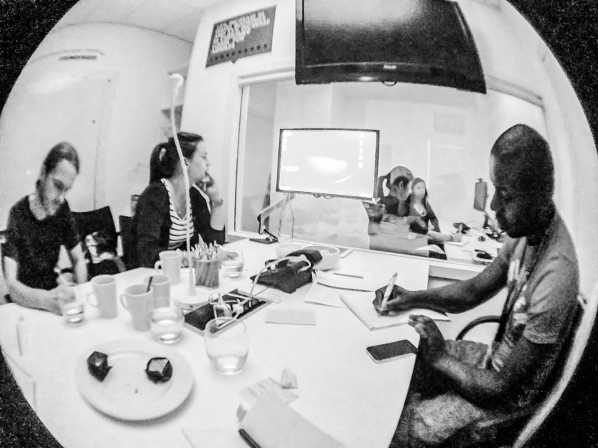
  • Conducted user research in stakeholder workshops to understand the individual digital experience needs and challenges of the six colleges.
  • Collaborated with developers to understand technical constraints and with visual designers to develop a compelling identity, information architecture, design systems, wireframes, and user journey flows.
  • Formulated a strategy to uphold each college’s unique character, achieve their key priorities and attract target audiences online.
  • Conducted usability testing to refine the designs based on feedback.

Impact: The meticulous research, rapid prototyping, and user testing led to an engaging and user-friendly digital experience for stakeholders. The brand and website reflect the unique character of each college, while also conveying the shared values and identity of the university as a whole. The university’s satisfaction rate has since increased by over 6%, and its ranking has improved, moving up 5 places to enter the country’s top 10.

University of the Arts London Website

Rewarding local and green spending: Get More Local branding

Brand design, art direction and marketing of a start-up that rewarded green purchasing and aided councils in increasing local economic activity. Local neighbourhood engagement through projects such as ‘Edible Garden’ competitions and weekend fairs. In 2011, Get More Local was awarded a UK Sustainable Business.


Zest Fest

As a sister brand of Get More Local, Zest Fest celebrated the cultural heritage and local artistic talent of the boroughs of Islington and Camden.

  • Created and managed all branding and promotional material.


BarGain

Bargain connects consumers with producers by facilitating communities to find, share and gain from local deals.

  • Developed brand strategy including strategic visioning, visual identity design and copywriting.
  • Won the London Entrepreneur Challenge 2010/11.


Planet Innovations

Voluntary visual identity and website design for non-profit company, promoting projects based around climate change between scientists, engineers and designers. While generating the identity and website, we engaged in online consultation for site features, as well as the eventual logo. Our intentions with the Planet Innovations logo was to invoke ideas of international communication, human interaction and connection with the planet, and open dialogue on technological platforms.

A new mark for an old friend: Japan Society

The UK’s leading body dedicated to enhancing the relationship between Britain and Japan embarked on a comprehensive rebranding project. The project revitalized its visual identity, logo, print materials, and website. With a membership base of over 1000 people, the society organizes numerous events and provides a wide range of resources to promote deep and lasting understanding between the two countries.

The rebranding process involved a strategic approach to effectively represent the society’s mission and values. The visual identity received a modern update, capturing the essence of the organization’s commitment to fostering a strong relationship between Britain and Japan. The new logo design symbolizes the harmonious connection between the two nations and serves as a visual representation of the society’s purpose.

The website underwent a comprehensive transformation, which included information architecture to enhance usability, content planning to deliver relevant and engaging information, and user interface design to provide an easy and visually appealing user experience.

The fresh visual identity and website positioned the society to continue its impactful work, attract new members, and reflect its commitment as the primary facilitator of cultural and business exchange between Britain and Japan.

Compass of Resistance

Voluntary visual identity design and art direction for the first two years of the festival. Developed logo and brochure to celebrate the local community and linked, broader cultural heritages. Developed logo and events brochure. Continues to operate as Community Interest Company and awarded ‘Venue Film Festival of the Year 2010’. Event material used experimental typography to appropriately present the festival’s four film locations (north, south, east, west) in the context of the year’s film theme of ‘resistance’.

Compass of Horror

Voluntary visual identity design and art direction for the first two years of the festival. Developed logo and brochure to celebrate the local community and linked, broader cultural heritages. Developed logo and events brochure. Continues to operate as Community Interest Company and awarded ‘Venue Film Festival of the Year 2010’. Event material used experimental typography to appropriately present the festival’s four film locations (north, south, east, west) in the context of the year’s film theme of ‘horror’.

Self-censorship

A series of typographic experiments for dissertation project, exploring the concepts and techniques of deceptive and manipulative nature of ‘spin’ in communication, rhetoric and politics. Research and collation of manifestos, speeches, interviews, journalistic analysis and public surveys all formed a basis for the work. This uncovered the use of common techniques, such as intentional ambiguity, cherry picking of facts, skirting, and simple denial of a common truth. The design response aimed to juxtapose selected themes of superficiality from the data, by establishing them as physical and tangible manifestations.

Self-censorship

Designed to censor itself.

Typerware

A series of typographic experiments for dissertation project, exploring the concepts and techniques of deceptive and manipulative nature of ‘spin’ in communication, rhetoric and politics. Research and collation of manifestos, speeches, interviews, journalistic analysis and public surveys all formed a basis for the work. This uncovered the use of common techniques, such as intentional ambiguity, cherry picking of facts, skirting, and simple denial of a common truth. The design response aimed to juxtapose selected themes of superficiality from the data, by establishing them as physical and tangible manifestations.

Typerware

The exploration based on modular geometry and maximising the overall density of information that can be fit in to a certain space.

Structural Ambiguity

A series of typographic experiments for dissertation project, exploring the concepts and techniques of deceptive and manipulative nature of ‘spin’ in communication, rhetoric and politics. Research and collation of manifestos, speeches, interviews, journalistic analysis and public surveys all formed a basis for the work. This uncovered the use of common techniques, such as intentional ambiguity, cherry picking of facts, skirting, and simple denial of a common truth. The design response aimed to juxtapose selected themes of superficiality from the data, by establishing them and as physical and tangible manifestations.

Structural Ambiguity

An appropriation of M.C. Escher’s original impossible cube. The forced perspective is both structured and ambiguous at once. This manifestation was welded out of steel to highlight the contradiction of substance and superficiality.

Soft metal maquette

Impossible cube manipulated and welded steel

Shattered Perspectives

A series of typographic experiments for dissertation project, exploring the concepts and techniques of deceptive and manipulative nature of ‘spin’ in communication, rhetoric and politics. Research and collation of manifestos, speeches, interviews, journalistic analysis and public surveys all formed a basis for the work. This uncovered the use of common techniques, such as intentional ambiguity, cherry picking of facts, skirting, and simple denial of a common truth. The design response aimed to juxtapose selected themes of superficiality from the data, by establishing them as physical and tangible manifestations.

Shattered Perspectives

An appropriation of Jos De Mey’s impossible window illusion that appears in two opposing perspectives at once. This typeface’s manifestation played referenced the silhouette of the Houses of Parliament while appearing like shattered glass.