Background: Architecture and design practice responsible for the award-winning 8 St James’s Square redevelopment.
Role: Project coordination and architectural typesetting for stone carving signage.


Background: Architecture and design practice responsible for the award-winning 8 St James’s Square redevelopment.
Role: Project coordination and architectural typesetting for stone carving signage.
A series of typographic experiments for dissertation project, exploring the concepts and techniques of deceptive and manipulative nature of ‘spin’ in communication, rhetoric and politics. Research and collation of manifestos, speeches, interviews, journalistic analysis and public surveys all formed a basis for the work. This uncovered the use of common techniques, such as intentional ambiguity, cherry picking of facts, skirting, and simple denial of a common truth. The design response aimed to juxtapose selected themes of superficiality from the data, by establishing them as physical and tangible manifestations.
Designed to censor itself.
A series of typographic experiments for dissertation project, exploring the concepts and techniques of deceptive and manipulative nature of ‘spin’ in communication, rhetoric and politics. Research and collation of manifestos, speeches, interviews, journalistic analysis and public surveys all formed a basis for the work. This uncovered the use of common techniques, such as intentional ambiguity, cherry picking of facts, skirting, and simple denial of a common truth. The design response aimed to juxtapose selected themes of superficiality from the data, by establishing them as physical and tangible manifestations.
The exploration based on modular geometry and maximising the overall density of information that can be fit in to a certain space.


A series of typographic experiments for dissertation project, exploring the concepts and techniques of deceptive and manipulative nature of ‘spin’ in communication, rhetoric and politics. Research and collation of manifestos, speeches, interviews, journalistic analysis and public surveys all formed a basis for the work. This uncovered the use of common techniques, such as intentional ambiguity, cherry picking of facts, skirting, and simple denial of a common truth. The design response aimed to juxtapose selected themes of superficiality from the data, by establishing them and as physical and tangible manifestations.
An appropriation of M.C. Escher’s original impossible cube. The forced perspective is both structured and ambiguous at once. This manifestation was welded out of steel to highlight the contradiction of substance and superficiality.


A series of typographic experiments for dissertation project, exploring the concepts and techniques of deceptive and manipulative nature of ‘spin’ in communication, rhetoric and politics. Research and collation of manifestos, speeches, interviews, journalistic analysis and public surveys all formed a basis for the work. This uncovered the use of common techniques, such as intentional ambiguity, cherry picking of facts, skirting, and simple denial of a common truth. The design response aimed to juxtapose selected themes of superficiality from the data, by establishing them as physical and tangible manifestations.
An appropriation of Jos De Mey’s impossible window illusion that appears in two opposing perspectives at once. This typeface’s manifestation played referenced the silhouette of the Houses of Parliament while appearing like shattered glass.

A series of typographic experiments for dissertation project, exploring the concepts and techniques of deceptive and manipulative nature of ‘spin’ in communication, rhetoric and politics. Research and collation of manifestos, speeches, interviews, journalistic analysis and public surveys all formed a basis for the work. This uncovered the use of common techniques, such as intentional ambiguity, cherry picking of facts, skirting, and simple denial of a common truth. The design response aimed to juxtapose selected themes of superficiality from the data, by establishing them as physical and tangible manifestations.
An appropriation of Bridget Riley’s Op art (optical art) and moiré. This combined with a bespoke modular typeface. Moire patterns are often an undesired artefact of recorded footage so this undesired aesthetic was intended to reference the recalling of politicians’ information for fact-checking. This typeface’s manifestation was created by securing graphics to translucent acrylic, and shining light directly at the subject, then shining a light from ‘behind the scenes’ in order to reveal more information.

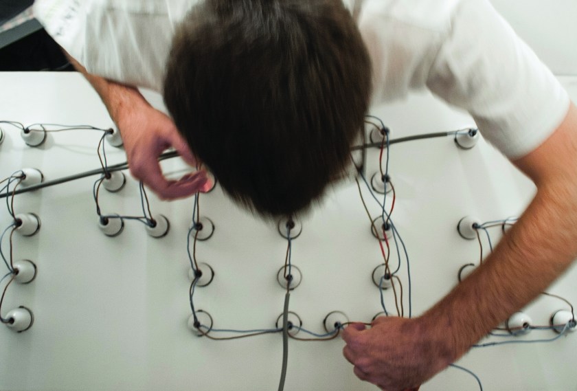
A series of typographic experiments for dissertation project, exploring the concepts and techniques of deceptive and manipulative nature of ‘spin’ in communication, rhetoric and politics. Research and collation of manifestos, speeches, interviews, journalistic analysis and public surveys all formed a basis for the work. This uncovered the use of common techniques, such as intentional ambiguity, cherry picking of facts, skirting, and simple denial of a common truth. The design response aimed to juxtapose selected themes of superficiality from the data, by establishing them as physical and tangible manifestations.
A sign that switches between the two statements, ‘support’ and ‘oppose’, referring to the process of rapidly switching ideas and the visual qualities of spotlights and vanity mirrors. Made from 81 bulbs fixed in holes cut from two-meter MDF board, and then lacquered white.